Correlation matrix
Problem
You want to visualize the strength of correlations among many variables.
Solution
Suppose this is your data:
set.seed(955)
vvar <- 1:20 + rnorm(20,sd=3)
wvar <- 1:20 + rnorm(20,sd=5)
xvar <- 20:1 + rnorm(20,sd=3)
yvar <- (1:20)/2 + rnorm(20, sd=10)
zvar <- rnorm(20, sd=6)


# A data frame with multiple variables
data <- data.frame(vvar, wvar, xvar, yvar, zvar)
head(data)
#>        vvar       wvar     xvar       yvar      zvar
#> 1 -4.252354  5.1219288 16.02193 -15.156368 -4.086904
#> 2  1.702318 -1.3234340 15.83817 -24.063902  3.468423
#> 3  4.323054 -2.1570874 19.85517   2.306770 -3.044931
#> 4  1.780628  0.7880138 17.65079   2.564663  1.449081
#> 5 11.537348 -1.3075994 10.93386   9.600835  2.761963
#> 6  6.672130  2.0135190 15.24350  -3.465695  5.749642
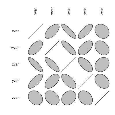
To make the graph:
library(ellipse)
# Make the correlation table
ctab <- cor(data)
round(ctab, 2)
#> vvar wvar xvar yvar zvar
#> vvar 1.00 0.61 -0.85 0.75 -0.21
#> wvar 0.61 1.00 -0.81 0.54 -0.31
#> xvar -0.85 -0.81 1.00 -0.63 0.24
#> yvar 0.75 0.54 -0.63 1.00 -0.30
#> zvar -0.21 -0.31 0.24 -0.30 1.00
# Make the graph, with reduced margins
plotcorr(ctab, mar = c(0.1, 0.1, 0.1, 0.1))
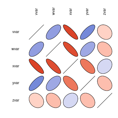
# Do the same, but with colors corresponding to value
colorfun <- colorRamp(c("#CC0000","white","#3366CC"), space="Lab")
plotcorr(ctab, col=rgb(colorfun((ctab+1)/2), maxColorValue=255),
mar = c(0.1, 0.1, 0.1, 0.1))
Notes
For more information on generating the correlation table (with numbers), see: ../../Statistical analysis/Regression and correlation