Plotting distributions (ggplot2)
Problem
You want to plot a distribution of data.
Solution
This sample data will be used for the examples below:
set.seed(1234)
dat <- data.frame(cond = factor(rep(c("A","B"), each=200)),
                   rating = c(rnorm(200),rnorm(200, mean=.8)))
# View first few rows
head(dat)
#>   cond     rating
#> 1    A -1.2070657
#> 2    A  0.2774292
#> 3    A  1.0844412
#> 4    A -2.3456977
#> 5    A  0.4291247
#> 6    A  0.5060559

library(ggplot2)
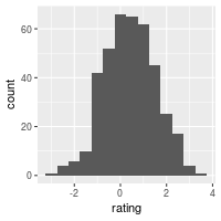
Histogram and density plots
The qplot function is supposed make the same graphs as ggplot, but with a simpler syntax. However, in practice, it’s often easier to just use ggplot because the options for qplot can be more confusing to use.
## Basic histogram from the vector "rating". Each bin is .5 wide.
## These both result in the same output:
ggplot(dat, aes(x=rating)) + geom_histogram(binwidth=.5)
# qplot(dat$rating, binwidth=.5)
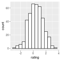
# Draw with black outline, white fill
ggplot(dat, aes(x=rating)) +
geom_histogram(binwidth=.5, colour="black", fill="white")
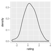
# Density curve
ggplot(dat, aes(x=rating)) + geom_density()
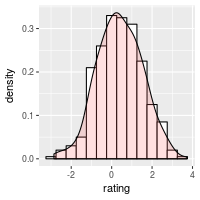
# Histogram overlaid with kernel density curve
ggplot(dat, aes(x=rating)) +
geom_histogram(aes(y=..density..), # Histogram with density instead of count on y-axis
binwidth=.5,
colour="black", fill="white") +
geom_density(alpha=.2, fill="#FF6666") # Overlay with transparent density plot
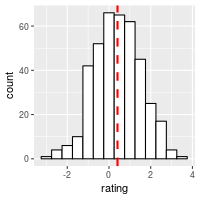
Add a line for the mean:
ggplot(dat, aes(x=rating)) +
    geom_histogram(binwidth=.5, colour="black", fill="white") +
    geom_vline(aes(xintercept=mean(rating, na.rm=T)),   # Ignore NA values for mean
               color="red", linetype="dashed", size=1)
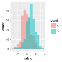
Histogram and density plots with multiple groups
# Overlaid histograms
ggplot(dat, aes(x=rating, fill=cond)) +
geom_histogram(binwidth=.5, alpha=.5, position="identity")
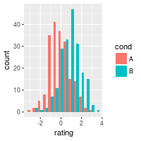
# Interleaved histograms
ggplot(dat, aes(x=rating, fill=cond)) +
geom_histogram(binwidth=.5, position="dodge")
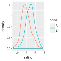
# Density plots
ggplot(dat, aes(x=rating, colour=cond)) + geom_density()
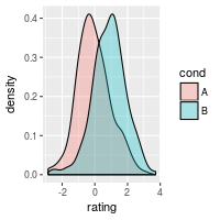
# Density plots with semi-transparent fill
ggplot(dat, aes(x=rating, fill=cond)) + geom_density(alpha=.3)
Add lines for each mean requires first creating a separate data frame with the means:
# Find the mean of each group
library(plyr)
cdat <- ddply(dat, "cond", summarise, rating.mean=mean(rating))
cdat
#> cond rating.mean
#> 1 A -0.05775928
#> 2 B 0.87324927
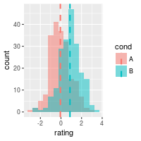
# Overlaid histograms with means
ggplot(dat, aes(x=rating, fill=cond)) +
geom_histogram(binwidth=.5, alpha=.5, position="identity") +
geom_vline(data=cdat, aes(xintercept=rating.mean, colour=cond),
linetype="dashed", size=1)
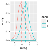
# Density plots with means
ggplot(dat, aes(x=rating, colour=cond)) +
geom_density() +
geom_vline(data=cdat, aes(xintercept=rating.mean, colour=cond),
linetype="dashed", size=1)
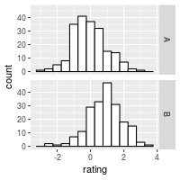
Using facets:
ggplot(dat, aes(x=rating)) + geom_histogram(binwidth=.5, colour="black", fill="white") +
facet_grid(cond ~ .)
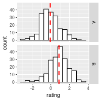
# With mean lines, using cdat from above
ggplot(dat, aes(x=rating)) + geom_histogram(binwidth=.5, colour="black", fill="white") +
facet_grid(cond ~ .) +
geom_vline(data=cdat, aes(xintercept=rating.mean),
linetype="dashed", size=1, colour="red")
See Facets (ggplot2) for more details.
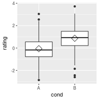
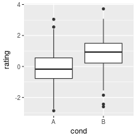
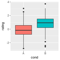
Box plots
# A basic box plot
ggplot(dat, aes(x=cond, y=rating)) + geom_boxplot()
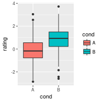
# A basic box with the conditions colored
ggplot(dat, aes(x=cond, y=rating, fill=cond)) + geom_boxplot()
# The above adds a redundant legend. With the legend removed:
ggplot(dat, aes(x=cond, y=rating, fill=cond)) + geom_boxplot() +
guides(fill=FALSE)
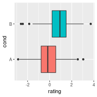
# With flipped axes
ggplot(dat, aes(x=cond, y=rating, fill=cond)) + geom_boxplot() +
guides(fill=FALSE) + coord_flip()
It’s also possible to add the mean by using stat_summary.
# Add a diamond at the mean, and make it larger
ggplot(dat, aes(x=cond, y=rating)) + geom_boxplot() +
    stat_summary(fun.y=mean, geom="point", shape=5, size=4)