Scatterplots (ggplot2)
Problem
You want to make a scatterplot.
Solution
Suppose this is your data:
set.seed(955)
# Make some noisily increasing data
dat <- data.frame(cond = rep(c("A", "B"), each=10),
                  xvar = 1:20 + rnorm(20,sd=3),
                  yvar = 1:20 + rnorm(20,sd=3))
head(dat)
#>   cond      xvar         yvar
#> 1    A -4.252354  3.473157275
#> 2    A  1.702318  0.005939612
#> 3    A  4.323054 -0.094252427
#> 4    A  1.780628  2.072808278
#> 5    A 11.537348  1.215440358
#> 6    A  6.672130  3.608111411

library(ggplot2)
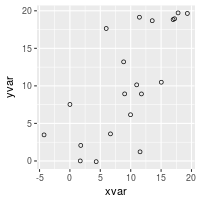
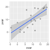
Basic scatterplots with regression lines
ggplot(dat, aes(x=xvar, y=yvar)) +
geom_point(shape=1) # Use hollow circles
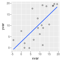
ggplot(dat, aes(x=xvar, y=yvar)) +
geom_point(shape=1) + # Use hollow circles
geom_smooth(method=lm) # Add linear regression line
# (by default includes 95% confidence region)
ggplot(dat, aes(x=xvar, y=yvar)) +
geom_point(shape=1) + # Use hollow circles
geom_smooth(method=lm, # Add linear regression line
se=FALSE) # Don't add shaded confidence region
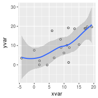
ggplot(dat, aes(x=xvar, y=yvar)) +
geom_point(shape=1) + # Use hollow circles
geom_smooth() # Add a loess smoothed fit curve with confidence region
#> `geom_smooth()` using method = 'loess'
Set color/shape by another variable
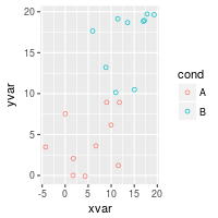
# Set color by cond
ggplot(dat, aes(x=xvar, y=yvar, color=cond)) + geom_point(shape=1)
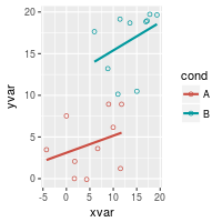
# Same, but with different colors and add regression lines
ggplot(dat, aes(x=xvar, y=yvar, color=cond)) +
geom_point(shape=1) +
scale_colour_hue(l=50) + # Use a slightly darker palette than normal
geom_smooth(method=lm, # Add linear regression lines
se=FALSE) # Don't add shaded confidence region
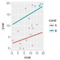
# Extend the regression lines beyond the domain of the data
ggplot(dat, aes(x=xvar, y=yvar, color=cond)) + geom_point(shape=1) +
scale_colour_hue(l=50) + # Use a slightly darker palette than normal
geom_smooth(method=lm, # Add linear regression lines
se=FALSE, # Don't add shaded confidence region
fullrange=TRUE) # Extend regression lines
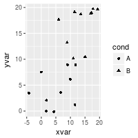
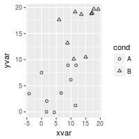
# Set shape by cond
ggplot(dat, aes(x=xvar, y=yvar, shape=cond)) + geom_point()
# Same, but with different shapes
ggplot(dat, aes(x=xvar, y=yvar, shape=cond)) + geom_point() +
scale_shape_manual(values=c(1,2)) # Use a hollow circle and triangle
See Colors (ggplot2) and Shapes and line types for more information about colors and shapes.
Handling overplotting
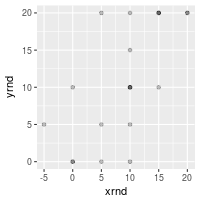
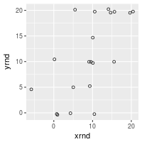
If you have many data points, or if your data scales are discrete, then the data points might overlap and it will be impossible to see if there are many points at the same location.
# Round xvar and yvar to the nearest 5
dat$xrnd <- round(dat$xvar/5)*5
dat$yrnd <- round(dat$yvar/5)*5

# Make each dot partially transparent, with 1/4 opacity
# For heavy overplotting, try using smaller values
ggplot(dat, aes(x=xrnd, y=yrnd)) +
    geom_point(shape=19,      # Use solid circles
               alpha=1/4)     # 1/4 opacity


# Jitter the points
# Jitter range is 1 on the x-axis, .5 on the y-axis
ggplot(dat, aes(x=xrnd, y=yrnd)) +
    geom_point(shape=1,      # Use hollow circles
               position=position_jitter(width=1,height=.5))